GT Super is the result of an extensive investigation into display serif typefaces from the 1970s and 80s. It captures their expressive nature and translates it into a well balanced system of Text and Display styles.
The Story
It all started with a newspaper clipping that Swiss designer Urs Lehni showed to Noël Leu. Fascinated by the simple beauty of the lowercase a, with pointed terminals instead of the usual serif at the top, Noël began drawing the typeface. This idea of opulent curves and a constant flow was carried throughout the entire design.
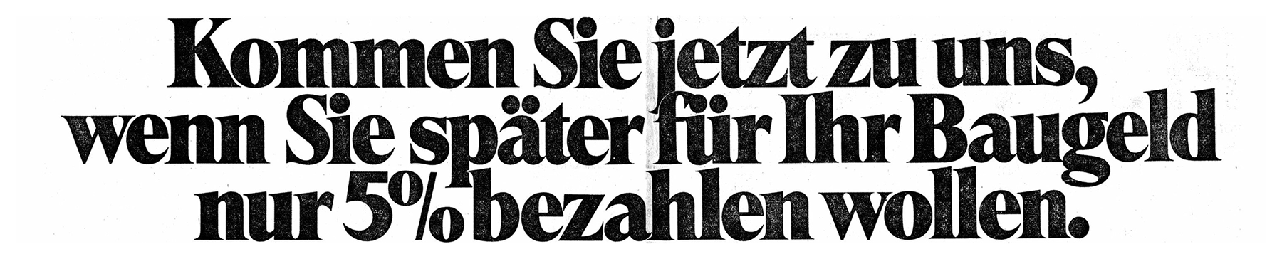
The original newspaper advertisement that started the project. Below, the same sample typeset in GT Super Display Super.
Kommen Sie jetzt zu uns, wenn Sie später für ihr Baugeld nur 5% bezahlen wollen.
We later found out that the typeface used in this advertisement, shown above, was some version of Perpetua Super — which lead us to GT Super’s name. The 1960s & 70s saw many such titling serifs created for the then-new phototype technology, and oftentimes quite different designs were marketed under the same name. Some of our favorite typefaces of that time are all the different versions of Perpetua, Trooper Roman, and Times Modern.
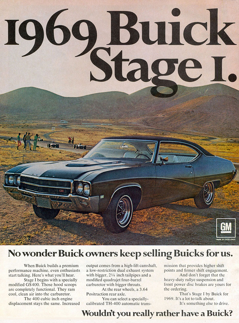
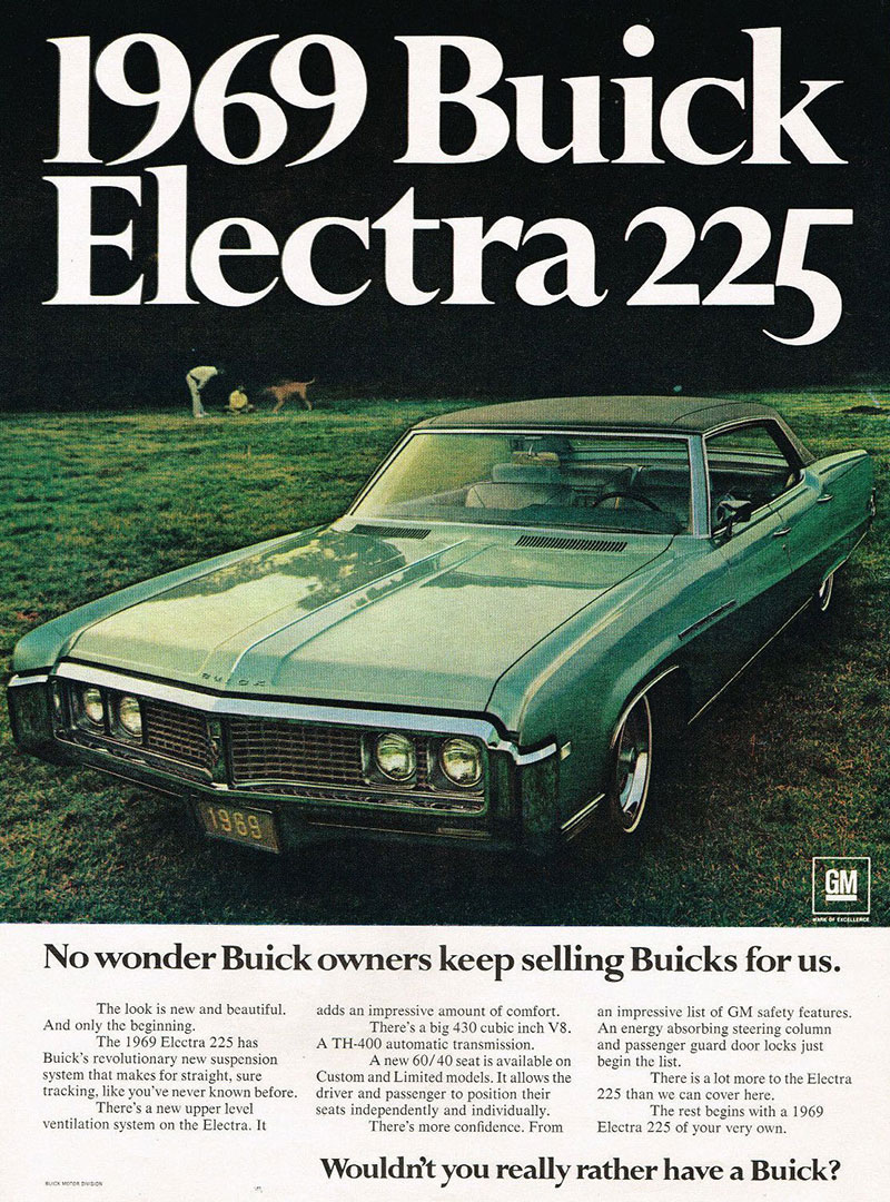
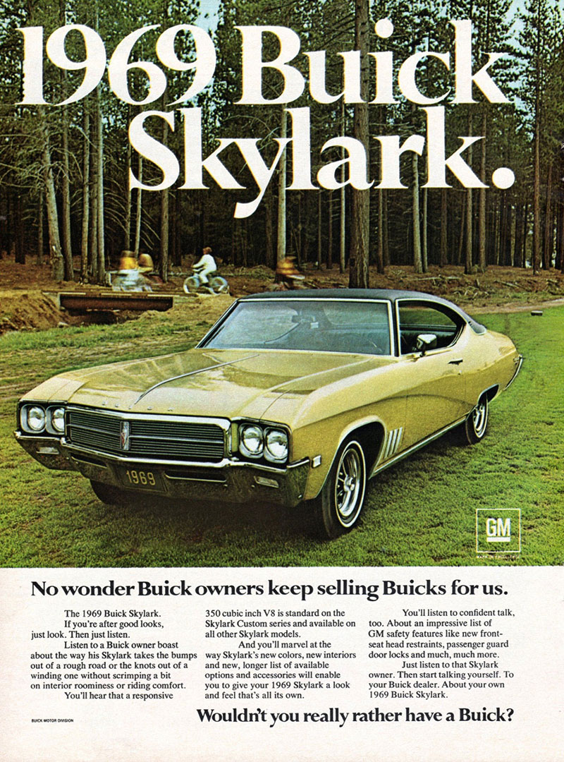
A version of Perpetua Bold used for Buick ads.Perpetua Super (origin unknown, carried by Lettergraphics) and Perpetua Black by Facsimile Fonts (probably copied from Headliners International).
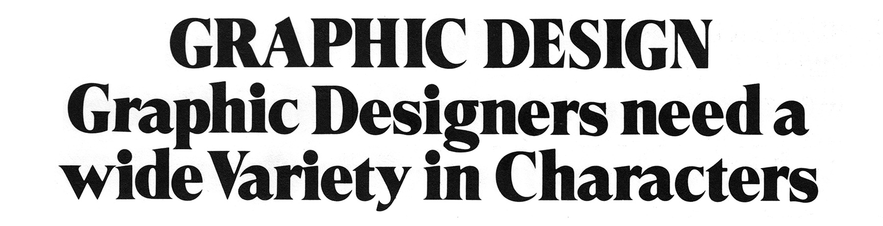
GRAPHIC DESIGN Graphic Designers need a wide Variety in Characters
Trooper Roman was designed by Dave Trooper in the late 60s. Trooper’s influence on GT Super is most notable in its alternate versions of the g and y. Together with a matching alternate a they are available in GT Super as stylistic alternates.
Dave Trooper designed Trooper Roman for VGC.
Times Modern is another example of a high-contrast display typeface from that era. Designed as a more narrow titling version of the original Times typeface, it features a much taller x-height and shorter descenders, enabling ultra-tight vertical typesetting. Noël was inspired by these proportions when designing the Display subfamily.
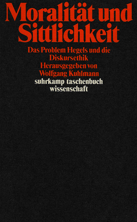
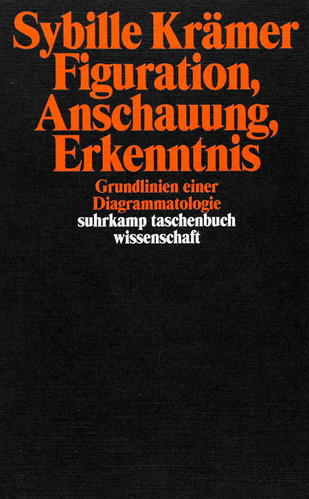
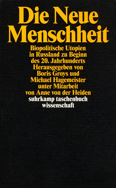
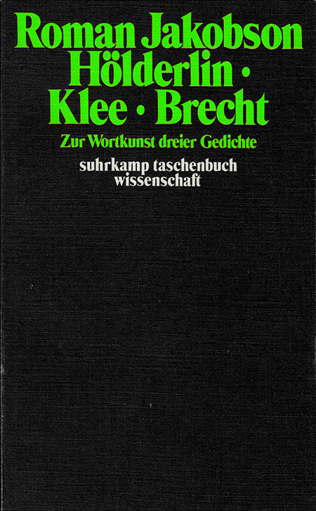
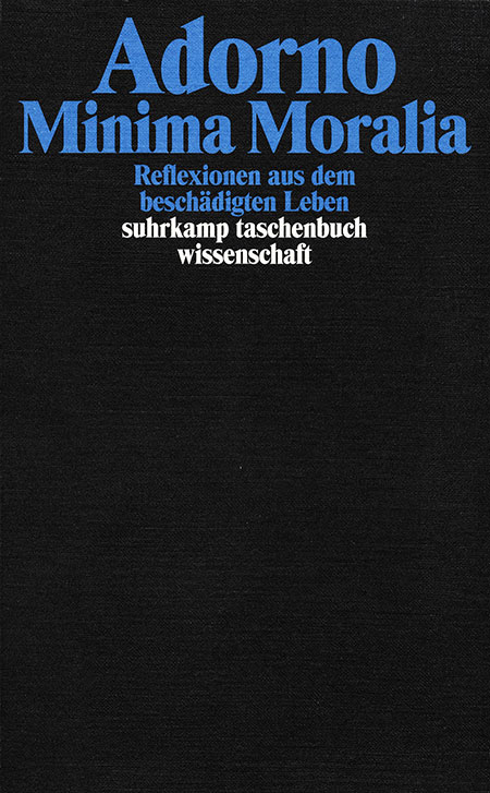
Iconic cover design template for German publishing house Edition Suhrkamp by Willy Fleckhaus, using Times Modern.
Moralität Sittlichkeit Figuration Anschauung Menschheit Russland Hölderlin Brecht Minima Moralia
As alluring as the expressiveness of these high-contrast, titling serif typefaces is — these very qualities limit their utility for text usage. Additionally, most typefaces of the genre were designed in only a single weight. Our goal with GT Super was to expand on the unique traits of those designs while building a consistent typographic system. The Display styles, with their fine details, work best when used large, while the Text styles focus on body copy performance.
The Design
Based on this history, we reversed the common approach taken when designing a typeface family: instead of first drawing the Text styles and then increasing the contrast for their Display variants, it’s the Text subfamily that follows the design of the Display styles. In both subfamilies, GT Super is focussed on the expressive and idiosyncratic nature of calligraphic motions, compelled into stable, typographic shapes.
GT Super began with the lowercase a of the Display Super roman style. Its outer curve flows without interruption, in one swift move, from nose to tail. This characteristic is mirrored throughout the typeface and defines both its details as well as its overall type color.
In the uppercase characters we find the same shapes. There are no abrupt serifs; instead the shapes grow organically out of the curves in a clear, lively way. The heavier the Display styles, the steeper the angles of their terminals. In the Text subfamily the sides stay vertical, which leads to a calmer rhythm.
Like its historical prototypes, GT Super Display is optimized for larger sizes. It sports all the ingredients of a titling serif: tall x-height, short descenders, narrow shapes, short serifs, and a very high contrast between thin and thick sections.
In comparison, the Text styles are more restrained and focused on an even texture for long reading. Thus Noël reconsidered the overall construction and horizontal dimensions. He pushed the concept found in the Display subfamily into a stricter, more usability-focused direction. Terminals end vertically and the lower contrast, as well as optical corrections like ink-traps and tapering, increase the legibility at small sizes.
Text Subfamily
Book Italic
Regular Italic
Medium Italic
Bold Italic
Black Italic
Display Subfamily
Light Italic
Regular Italic
Medium Italic
Bold Italic
Super Italic
While sharing the three middle weights with its Text sibling, the Display subfamily broadens the spectrum by adding two more extremes: the delicate Light and hefty Super.
Letting go of any specific historical model, the italic styles take their inspiration from broad-nib pen calligraphy and compel the rhythm and speed of handwriting into typographic form. The Text subfamily’s italic sports pronounced ink traps and a stressed slant angle.
With its roots in 70s and 80s titling type, GT Super unites a variety of sources both from long and not-so-long ago into a new, coherent whole. By clearly distinguishing between its Display and Text subfamilies it covers a large spectrum of applications. From flashy headlines to highly readable body text it always provides dynamic, fierce, and consistent expression.
GT Super was designed by Noël Leu. Additional help by Mirco Schiavone and Reto Moser. Discovery of original sample by Urs Lehni. Type animations realized by Josh Schaub. Help with writing by Patrick Savolainen. A big thank you to Florian Hardwig for providing high-resolution scans of historical typeface samples. Website designed and developed by Grilli Type and Informal Inquiry with additional development by Thirty.